One Page Comic - In Another Artist's Style
For this project, we were asked to practice analysing other artist's styles and mimic them by picking an artist to analyse and copy the style of.
To practice this we made presentations on assigned artists outlining the main traits of their style. I was assigned Cam Kennedy, an artist who worked on Deadpool and Starwars alongside other works and who largely focused on ink art with very stylised faces and tons of detailing and texture expressed in his lines.
I made a short presentation where I talked about his Line Quality, colours and values, anatomy and shape choices and the way he layed out panels.


The One Page Comic
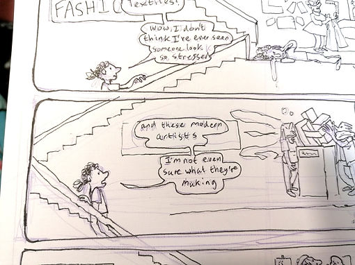
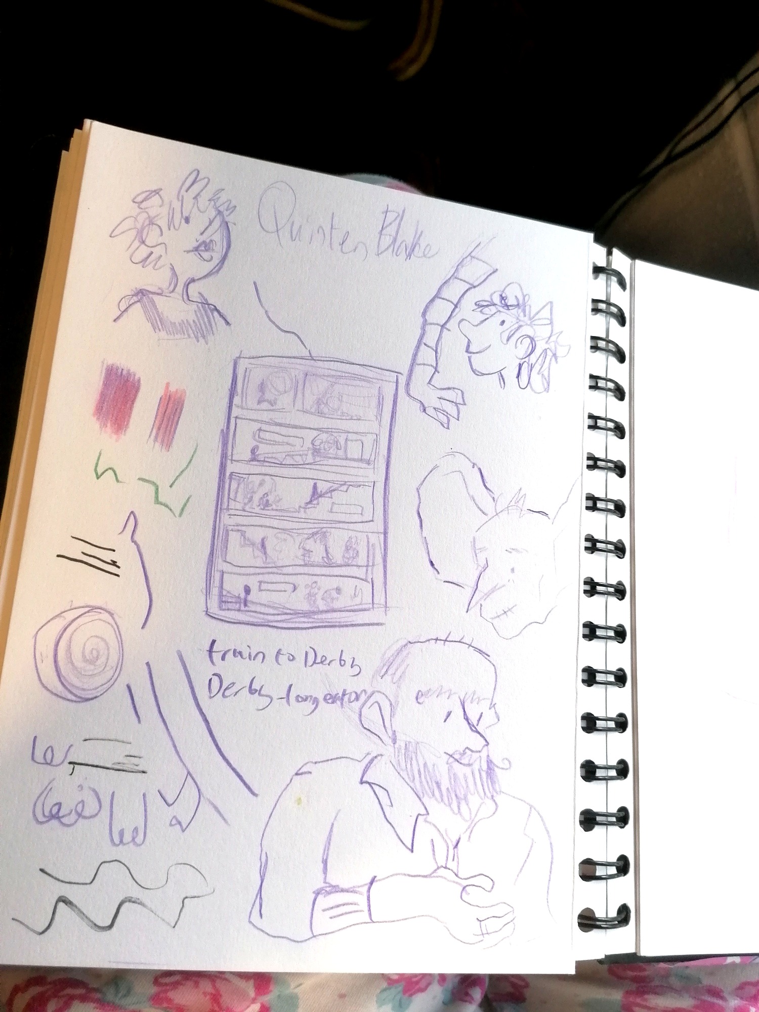
For the One Page comic, we got to choose from a list of artists, I selected Quentin Blake since his style is very simple yet messy which seemed like it'd be interesting to try and recreate.
I gathered up images he made and started to analyse them.
For colour I considered that he might be using watercolour paint, acrylic paint, gouache or digital art. I decided it definitely wasn't digital due to how long he's been illustrating and I also decided it couldn't be watercolour since while he has some running paint textures most of his art is very smooth and opaque with bright colours. I ended up ruling out Acrylic due to the watercolour type textures mentioned above so that left gouache which when I tested it was a very good dupe for his colouring style.
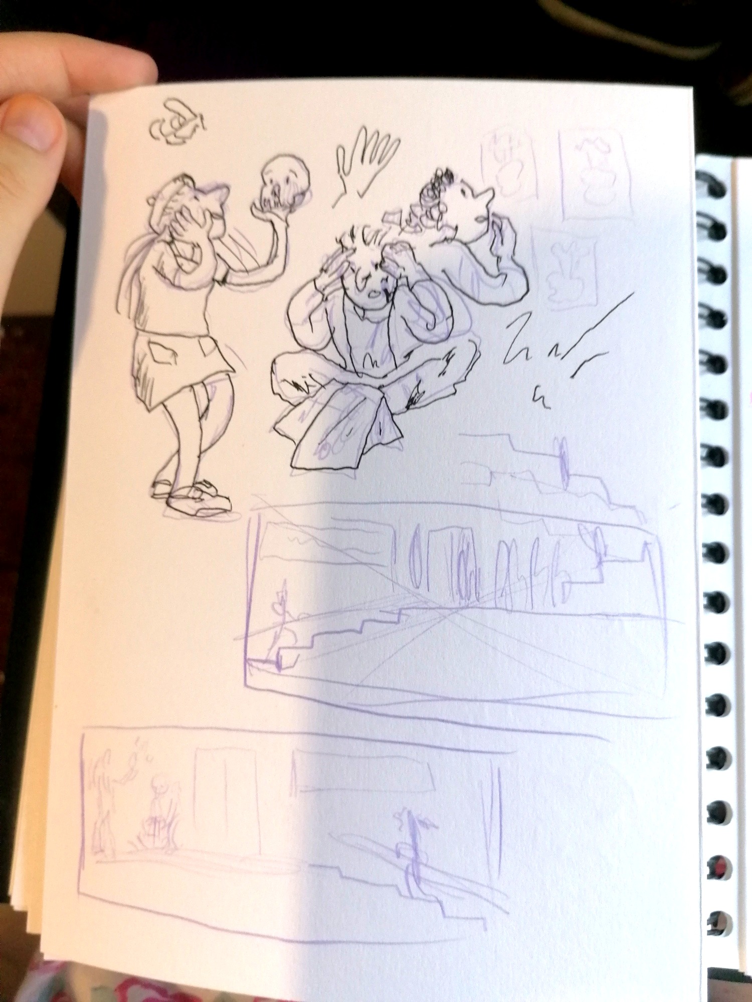
One cool thing I noticed while looking at his art was how he would show motion in how he drew characters like on image where he drew a character shaking another one's hand and the arm was wavy as if it was being shaken by the force of the handshake.
The linework had blunt tips and a very even tone even though he had clearly made a lot of fast, uneven lines and scribbles. It was suggested to me that he used a dip pen but I've worked with one on big projects before and to get a line that even you'd have to go very slowly which would probably force the line to be smooth and not jagged. There's a chance he uses a specialised nib but none of the ones I own were able to recreate those kinds of lines. I decided to try with a sakura micron, blunt-tipped pen since the lack of flexibility would force my line weight to be even and the ink is very consistent, I also had to hold the pen kind of weird to recreate the kind of lines I wanted.
His anatomy looks like a stick figure was given some meat aside from the larger heads and feet. Blake draws all five fingers on his hands most of the time and isn't afraid to use sharp shapes and move the body in ways that don't work on a real human while still clearly understanding how to pose a figure well enough that it still looks good. His faces are often sloping with large round or upturned noses, dot eyes and small line mouthes although he will sometimes draw lips onto characters as well as blemishes. The hair on his characters often fuses into the skull with no clear hairline.


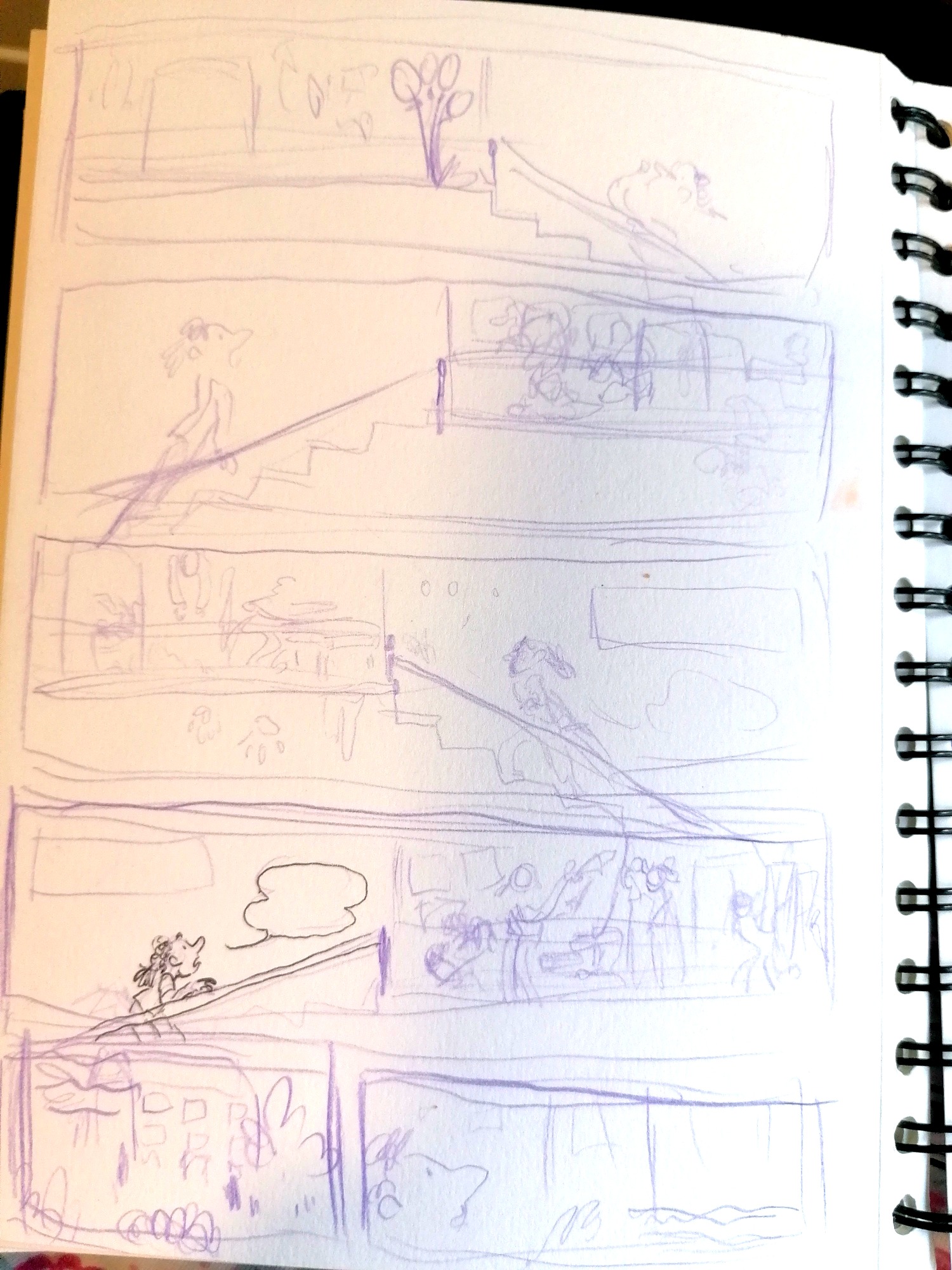
For the final comic, I decided to make mine a cute little gag page about a person in an art school going up to different floors and seeing the strange people in the different courses including the comics course on the top floor which they conclude is probably the strangest. I decided to insert references to things we did throughout our first year since we've tried out so many different things.
I did thumbnails to plan the layout and flipped it so the comic rather than being read top to bottom goes bottom to top so that it looks like it could be us looking into a building.


I made the final comic on bristol board with my fine liner pen. I was planning to make it in full colour but settled for linework due to time constraints.