Skill Building
This section of the module was more of a dealer's choice where we were given 6 skill-building exercises to choose from and were required to complete two of them.
The exercises were: Interpreting a script into a comic page, Drawing 4 more pocket cartoons, Redrawing a comic page made by a course tutor, A two page comic about a cause, A two page comic about an artist or to deconstruct 3 comic pages
I chose to Interpret the assigned comic script and redraw the comic page our teacher had made advertising the school.
I chose these because interpreting scripts is a useful skill for me if I want to be able to work on teams in the future and the redraw because the page had a lot of text, something I struggle with sizing and formatting and placing, meaning it was a good way to challenge myself.

Exercise 1
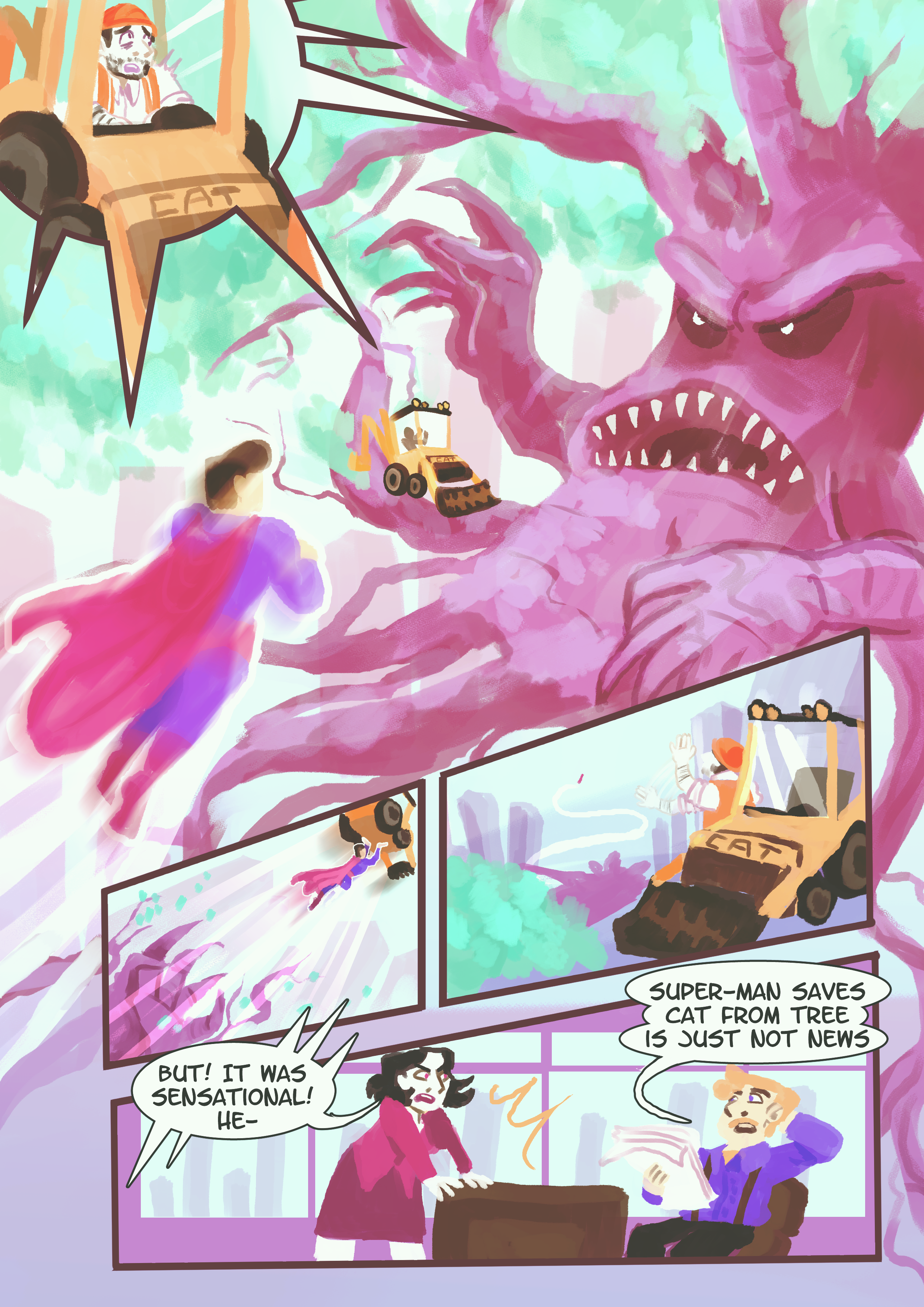
Comic Script
The comic script we were assigned was very detailed, it set up the location and characters very simply and easily and even linked to a photo reference of the CAT brand digger the writer wanted in the scene for the sake of the punchline. It was split into 5 panels to work with. I decided to follow the direction fo panel 1 being a close shot and make it pretty small and panel 2 has a giant creature in it so I decided to make it the biggest on the page, breaking the borders to give a sense of size. The rest was up to a lot of interpretation so I made some thumbnails to try and figure out what I wanted. The first was closest to a more classic comic layout while the others played with the large splash panel for panel 2. I ended up liking the fourth best since it followed the diagonal lines of 3 which felt like they added a lot of action while having the first panel be exciting so you don't skip over it right away. From there I did a loose sketch for the placement of characters and refined it so I'd have something to work with on the render. At this point I also made the panels neat and added the speech bubbles, using the font LetterOmatic since it was very easy to read at a small size and felt comicy (I had also recycled it from project 2 as I lettered that first and then this). Finally, I did the render and decided to experiment with the gouache brush, I tried for a less limited palette and used a lot of overlays to try and unify it as I went and since I was unused to the gouache brush I feel like the whole thing got a little clumsy and ugly but I do enjoy the painterly feeling so I'm not sure if I'd call this success or failure. I can see it working well in my usual style but the slight realism that comes with adding the dappled leaves and such seems more true to how a lot of modern superhero comics are with their slightly more human proportions and detailed backgrounds and modern settings.

Exercise 2
Redraw
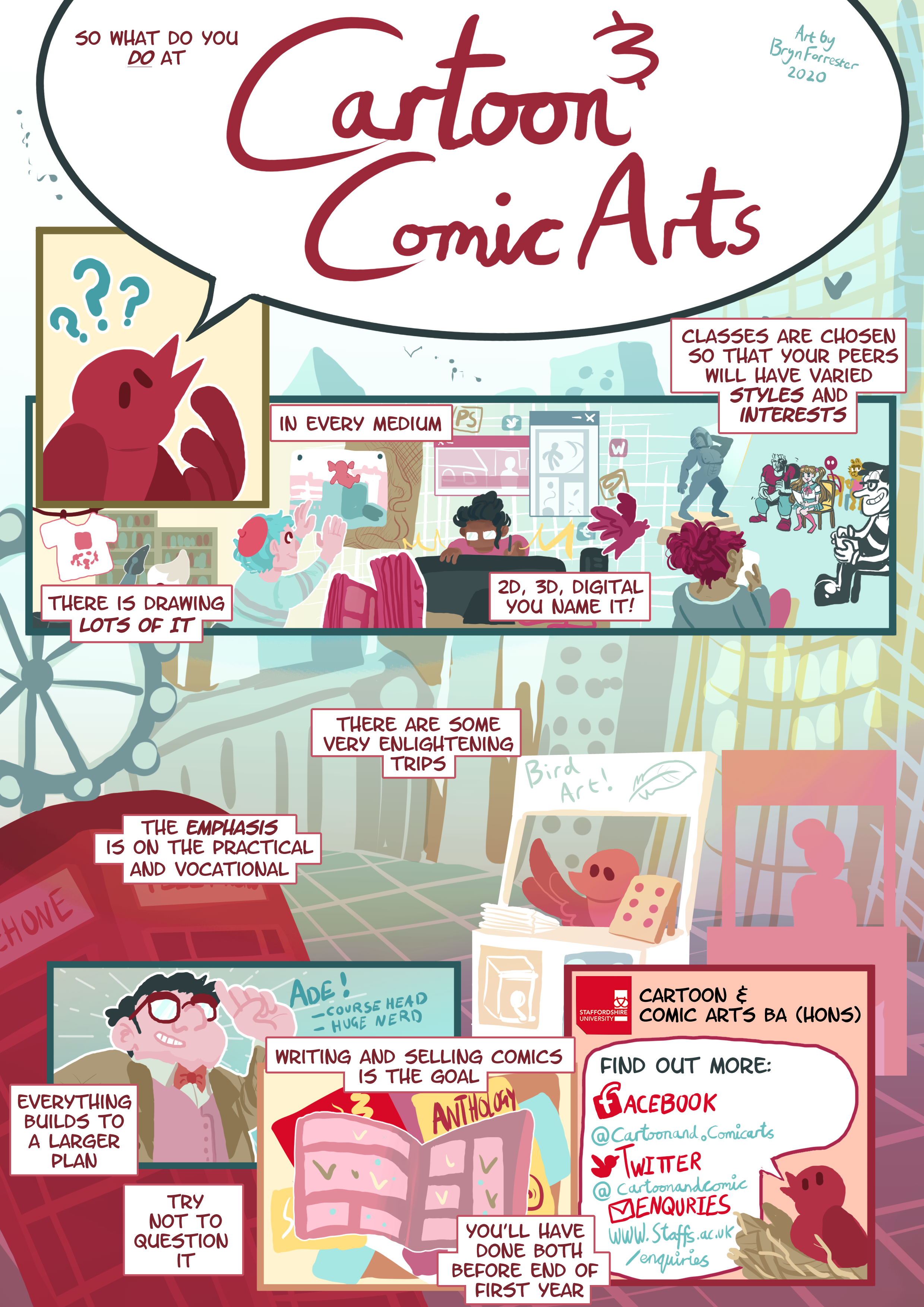
For this exercise, the most important thing in my eyes was to break down Conan's comic page he made in his first year, find what I was able to improve and then work from there. The things I identified as issues were the text boxes that took up half of each panel, the lack of panel variety which made it feel very simple, the all over the place colours that were all super saturated and clashed and the fact it was a lot of talking heads.
I decided to try and make the layout feel more open and bring in some limited colours as well as spacing out the text, editing it down where I could. The first step was the layout, I made a few thumbnails to try and figure out what I wanted, I ended up fusing panels 2 and 3 and making the title a giant speech bubble since I loved how in the original a character was saying the title, I decided to change it from a dog to a bird because I knew I wanted the character to be red like the staffs logo and didn't want a clifford the big red dog connection. I dialed back a lot of the references outside of the part of the panel showing the many styles of classmates, this was largely because when you advertise a school it's not just to students but to families too and a certain feeling of professionalism can go a long way, I actually tried to make the whole thing feel like a student made comic booklet I read while I was touring universities myself that stuck out to me.
After trying a few combinations I settled on one where the third panel was very large and would gradient from light to dark, making the other panels stick out from it and overlapped the panels a lot like newspaper clippings. After that I went to the sketch where I added in all the panel borders and the text so I'd have a strong layout, I decided to hand-letter the title and the social media links since it looked nice. I then did the detailed sketch that I'd work from. I stuck to my simple chunky style with lots of gradients and used a primary colour scheme of yellow, red and blue with blue as the main colour and red as the most prominent and saturated accent since it's the staffs uni colour and I wanted it to stick out easily. I considered red and green for a time but didn't want to risk it looking too festive.
The final result looks very calm and airy which I really like, it feels pleasant to look at while having a chaotic format rather than looking chaotic with a more structured format. I do wish I'd made the 'what do you do' at the start a little larger but otherwise am very happy with the result.