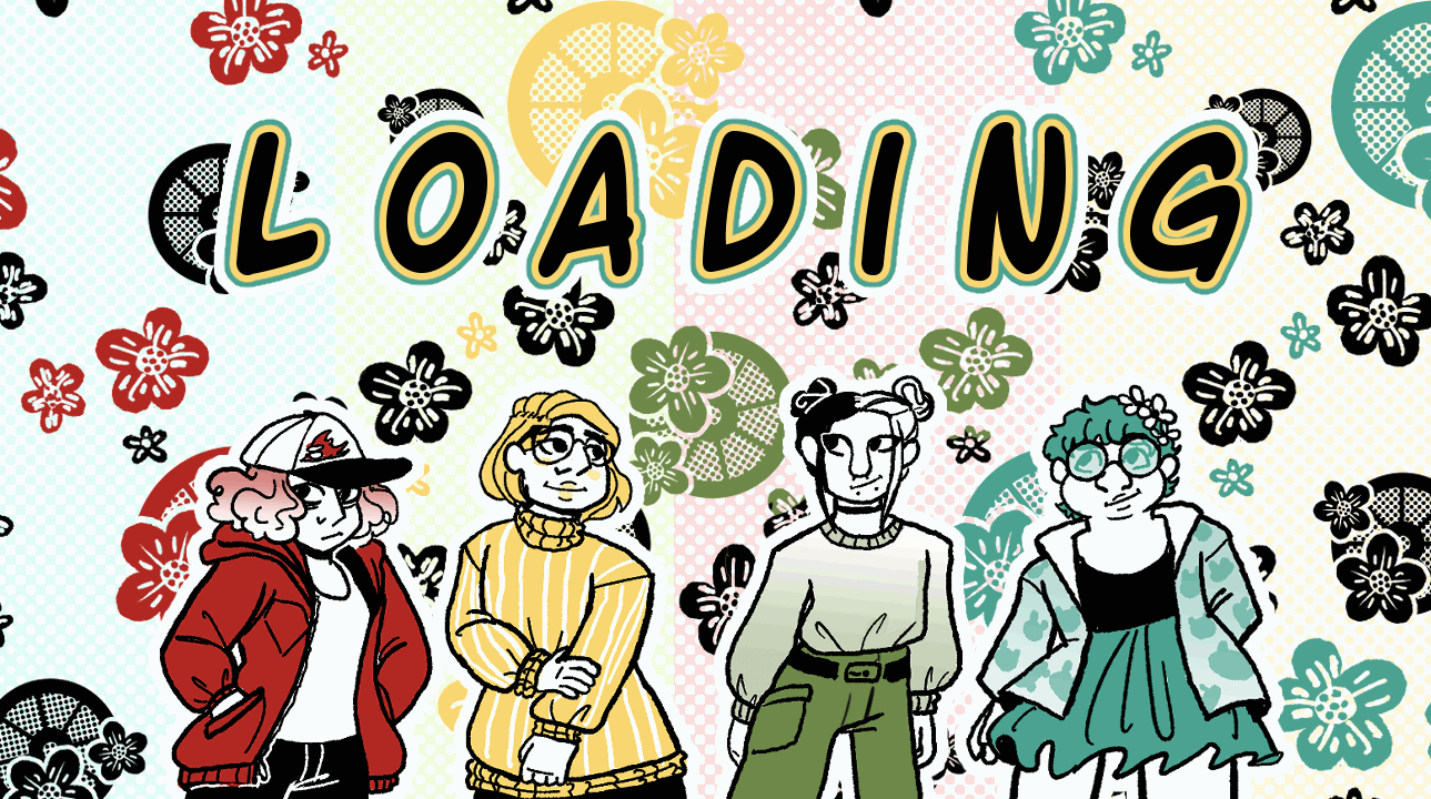
Webcomic Project:
Pickle n' Elderflower
The Bygone Market
This semester we were asked to form teams, make a comic company and then produce and market 4 webcomics. This was a stand in for the comic con project usually done in second year and a chance for us to stretch creative muscles and create longform comics for the first time in the course. My team got started early discussing names and branding, we had two large discord meetings to decide the name and colour scheme of the comic early in the semester and settled on Pickle n' Elderflower. We chatted in a discord which I will archive so you can view any of our conversations from the whole semester if you wish but the highlights and my personal process
Step 1 - choosing a story and united theme
Our first important step was figuring out a general mood and theme to our comics, we wanted there to be a clear through line. The first thing we chose was actually what sections in the Webtoon archive we wanted them all to show up in, choosing slice of life, fantasy and historical as our main three genres. Then it was time to discuss what would really link the comics. An early idea was to have them all set in the same building/town at different points in time, perhaps with a time travel element allowing crossovers between the stories. But then we realized in doing that we'd not only force people to probably have to read the comics in a specific order, but that time travel is an especially hard story element to execute well and would involve us negotiating hard rules for our stories.
However we realized with us having a member who had a strong interest in telling a story set during ancient history and the rest of us being less interested in doing that, it made sense to maybe keep the time aspect by having each comic set in a different time period but in the same larger world, each story being self contained but still clearly in the same world.

With that decided it was time to start looking up inspiration images and making concept sketches. At the time I was also working on character designs for something else and had been enjoying drawing animal inspired people and showed it to the group as a potential fantasy race since we were settled on a magical setting. Eventually this ended up leading to us settling on the animal style people that are present in all of our comics.
After this we had a couple of calls together discussing the branding side of things, we wanted a name for our comics 'company' that would be more inspiring of feelings than something literal and ended up going through tons of random words to find a combination we liked. We came up with as many options as we could in call and wrote them into cheat, then voted in multiple rounds with different reactions until we found a winner which was 'Pickle and Elderflower'
The next thing was to figure out a cohesive art style, we decided if the colouring in our comics was consistent and went well together then our different styles would mesh well. We settled on having black and white comics with a pop of one colour each which we'd bring together for all the branding, the thought being you could leaf through a print comic of all of our work and it would look really nice together.
Below are the conversations we had that Jasper screenshotted for us so we could reference it back and make sure Meg got to see anything she missed since she was busy at the time.
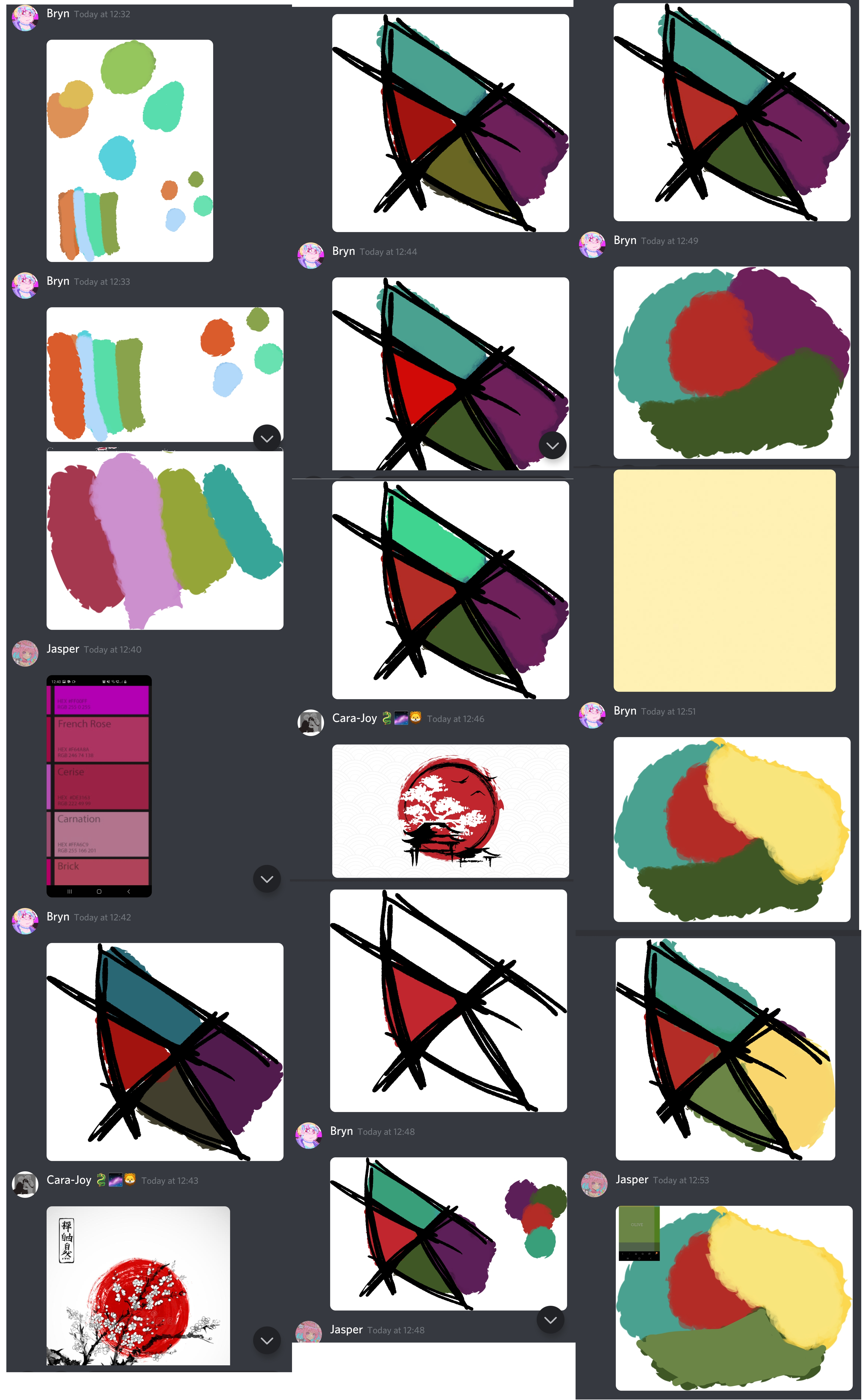

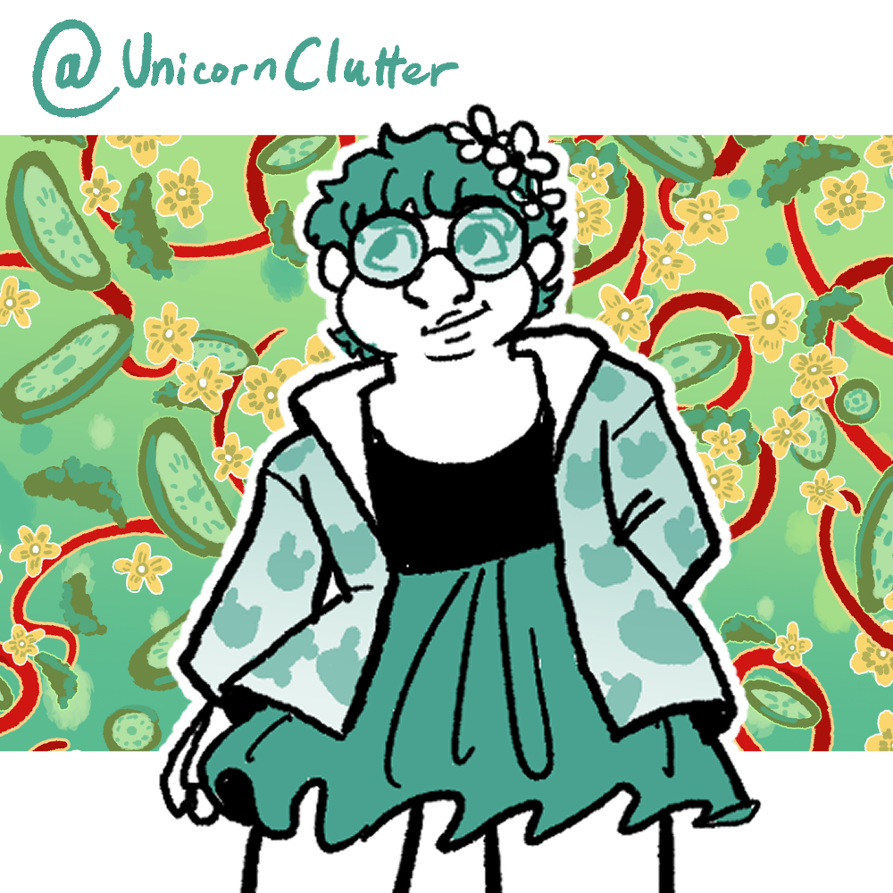
With those decisions out of the way it was time to start working on making us all the social media accounts we might need and then making some icons and banners for us to use. I started the ball rolling for it as a lot of the group was pretty buisy and made us an icon, banner image, twitter, instagram, youtube, twitch and linktree. I decided any other social media we needed and the redbubble, webtoon and tapastic accounts could wait for the time being and made certain the passwords on all the accounts were the same and accessible to the whole group as well as offering to help any of us post to any of the accounts if they had an image and no time.
I also at this point was brainstorming posts we could make before all our concept work was finished and drew a small portrait of each of my teammates and myself and made them usable as potential twitch avatars and square posts for twitter and instagram with their links writtain on them. My teammates considered doing it as a 'draw this in your style' type thing where they also would make four drawings of each of us to show style differences but I think work must have gotten in the way of that becoming a reality sadly.
Icon and Banner
Initial hope with this was if everybody had done the
redraw like they wanted to have us each have the
avatar we drew for ourselves
Step 2 - Beginning comic work
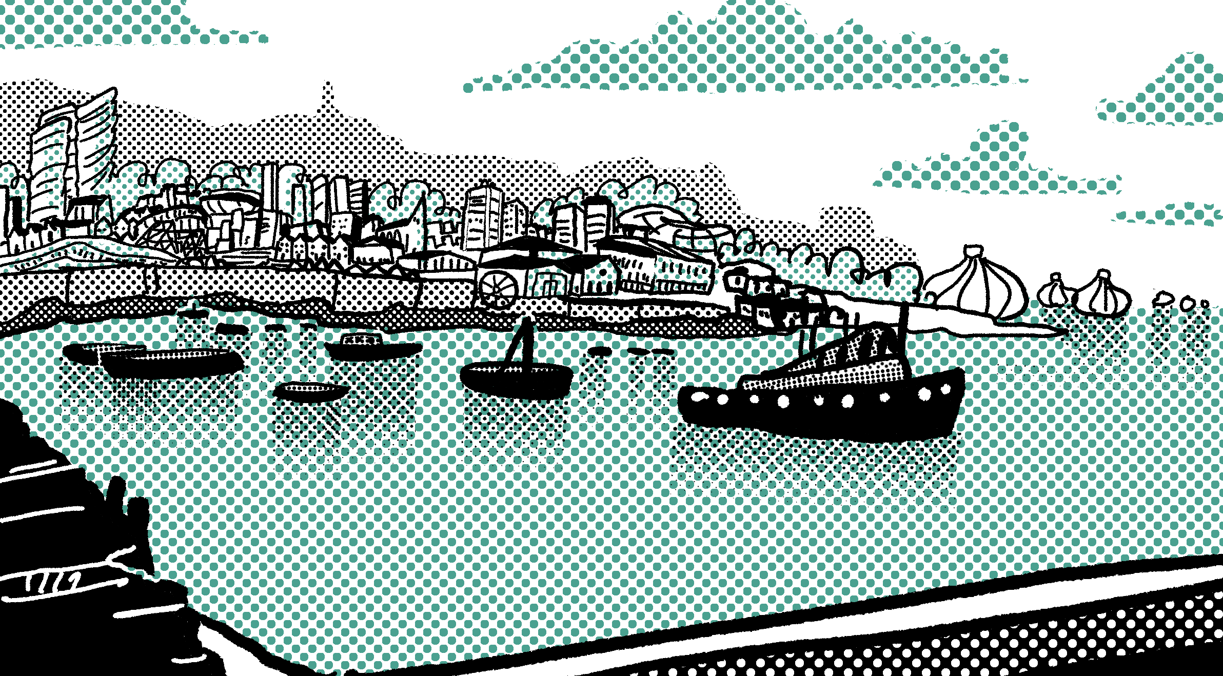
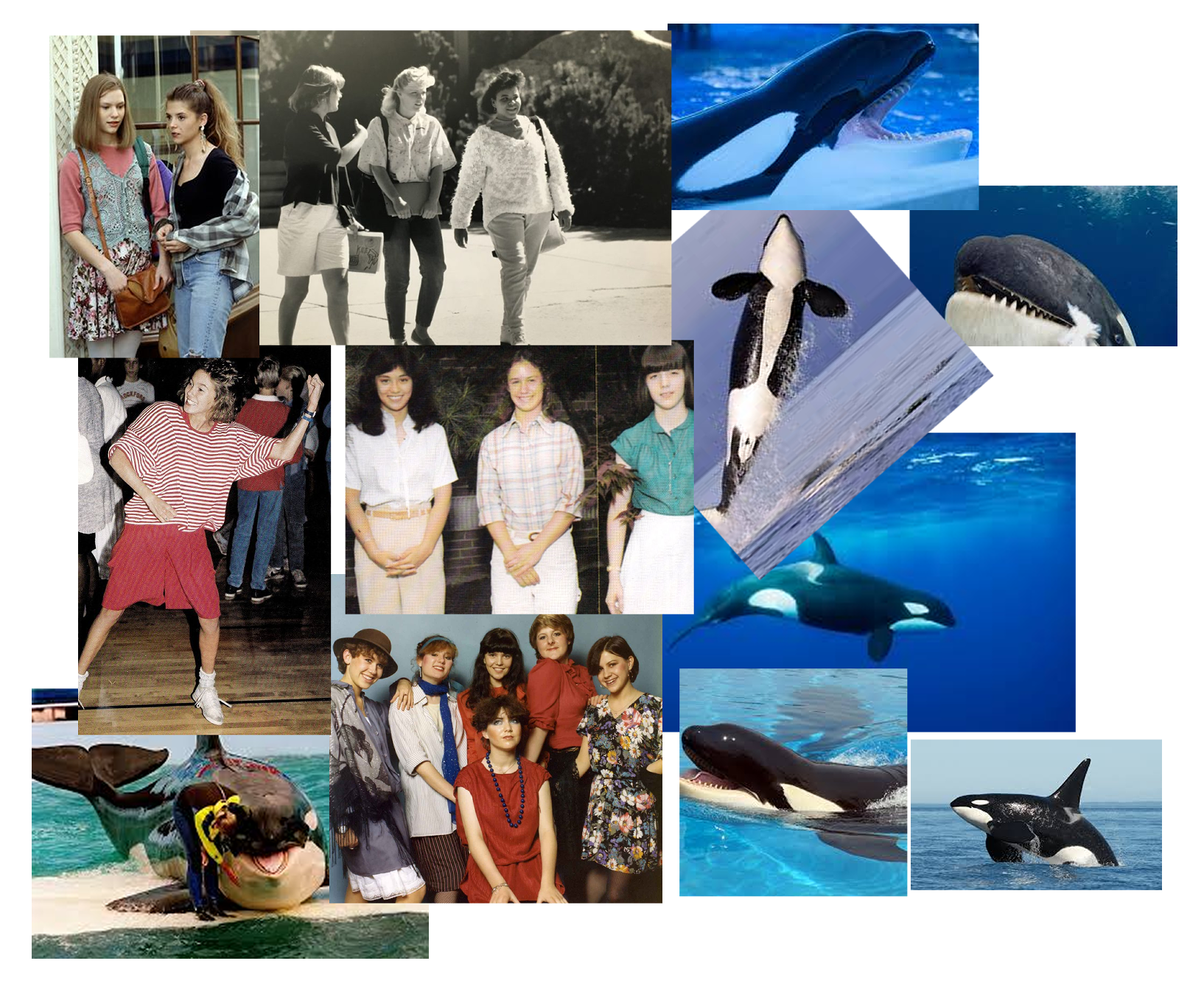
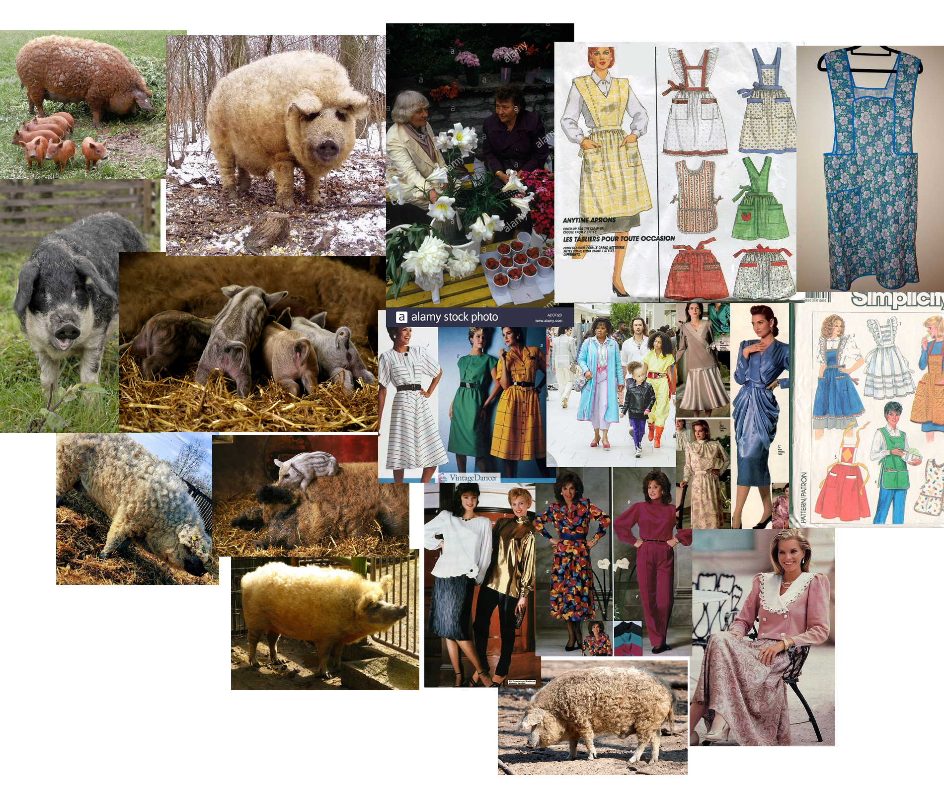
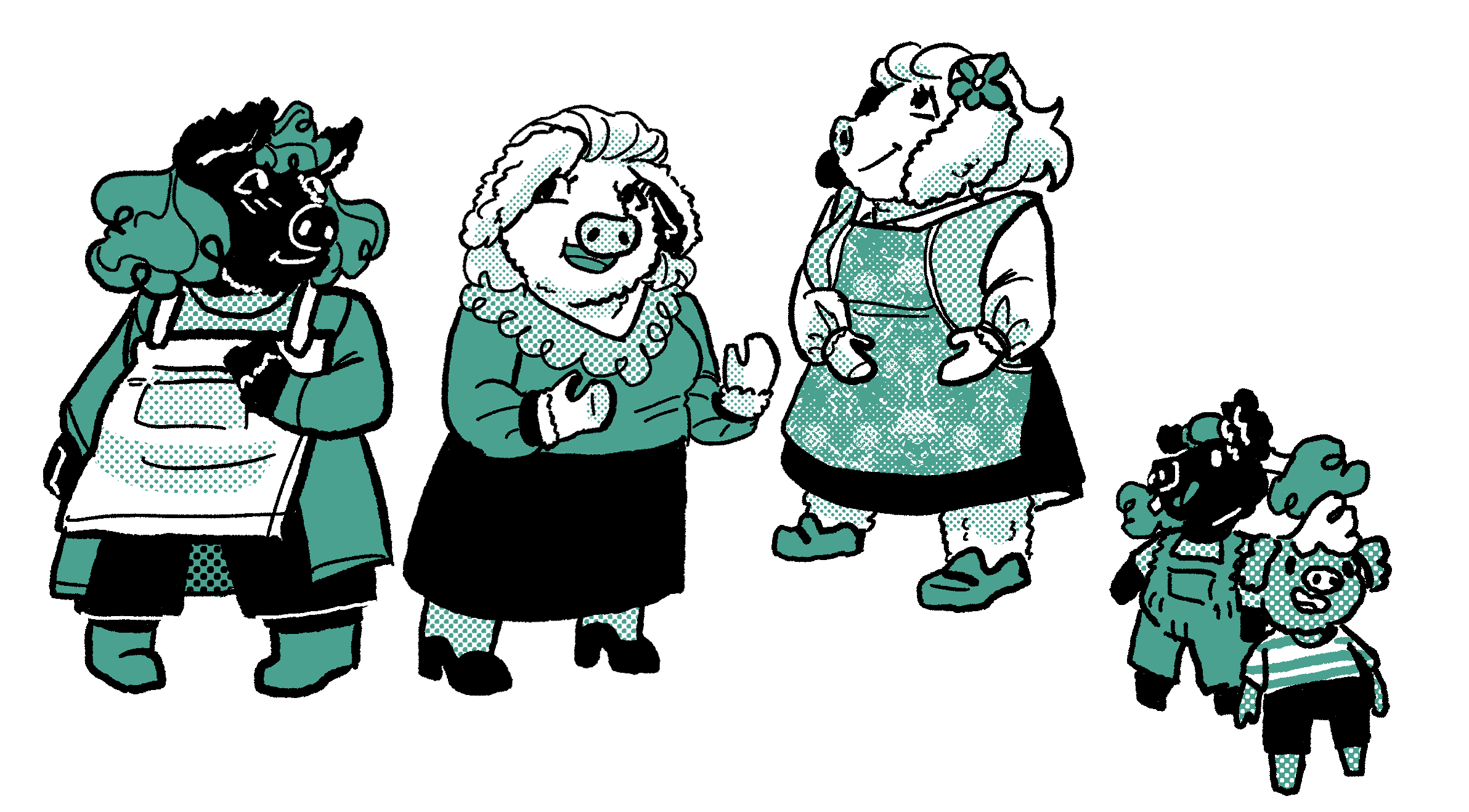
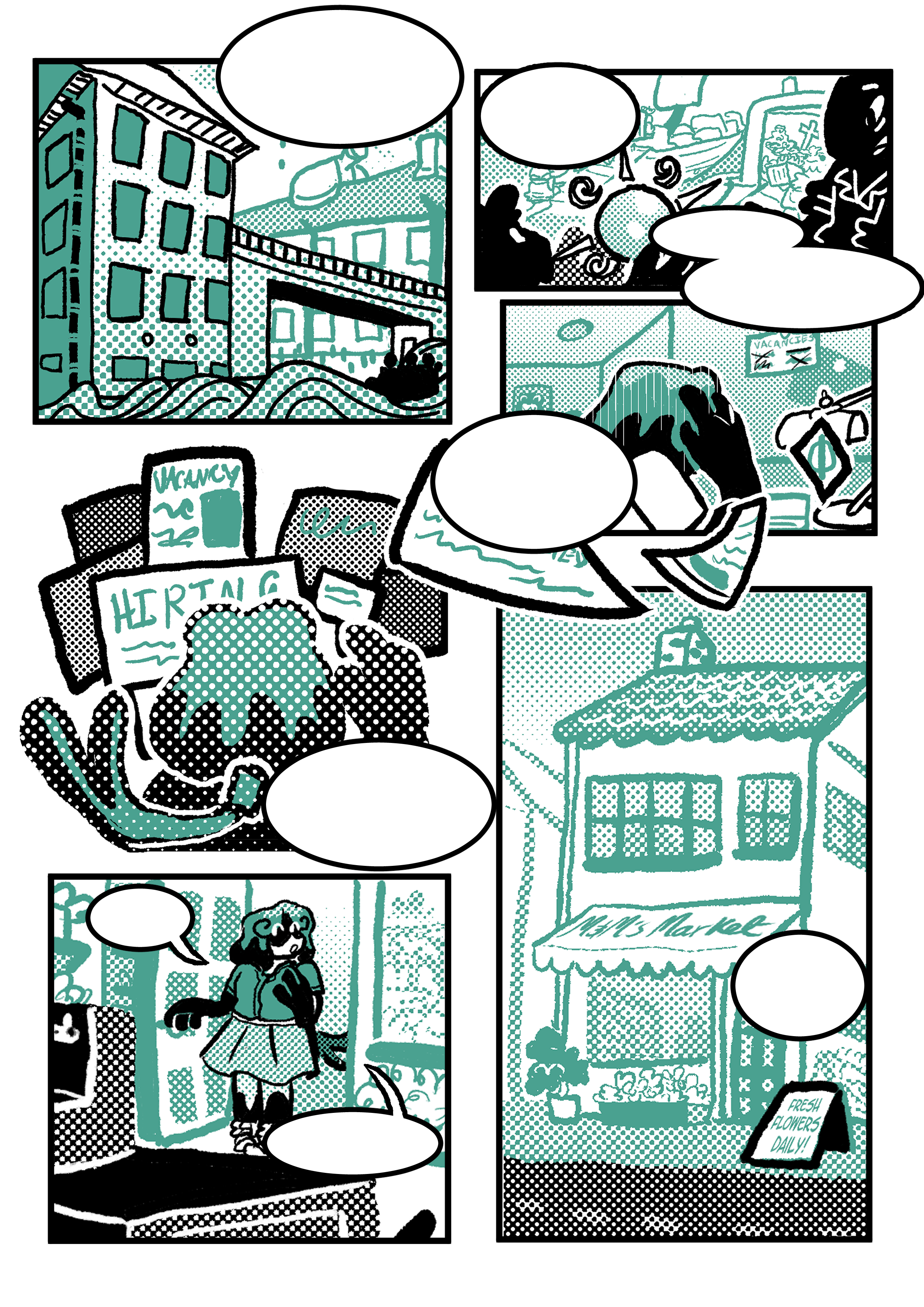
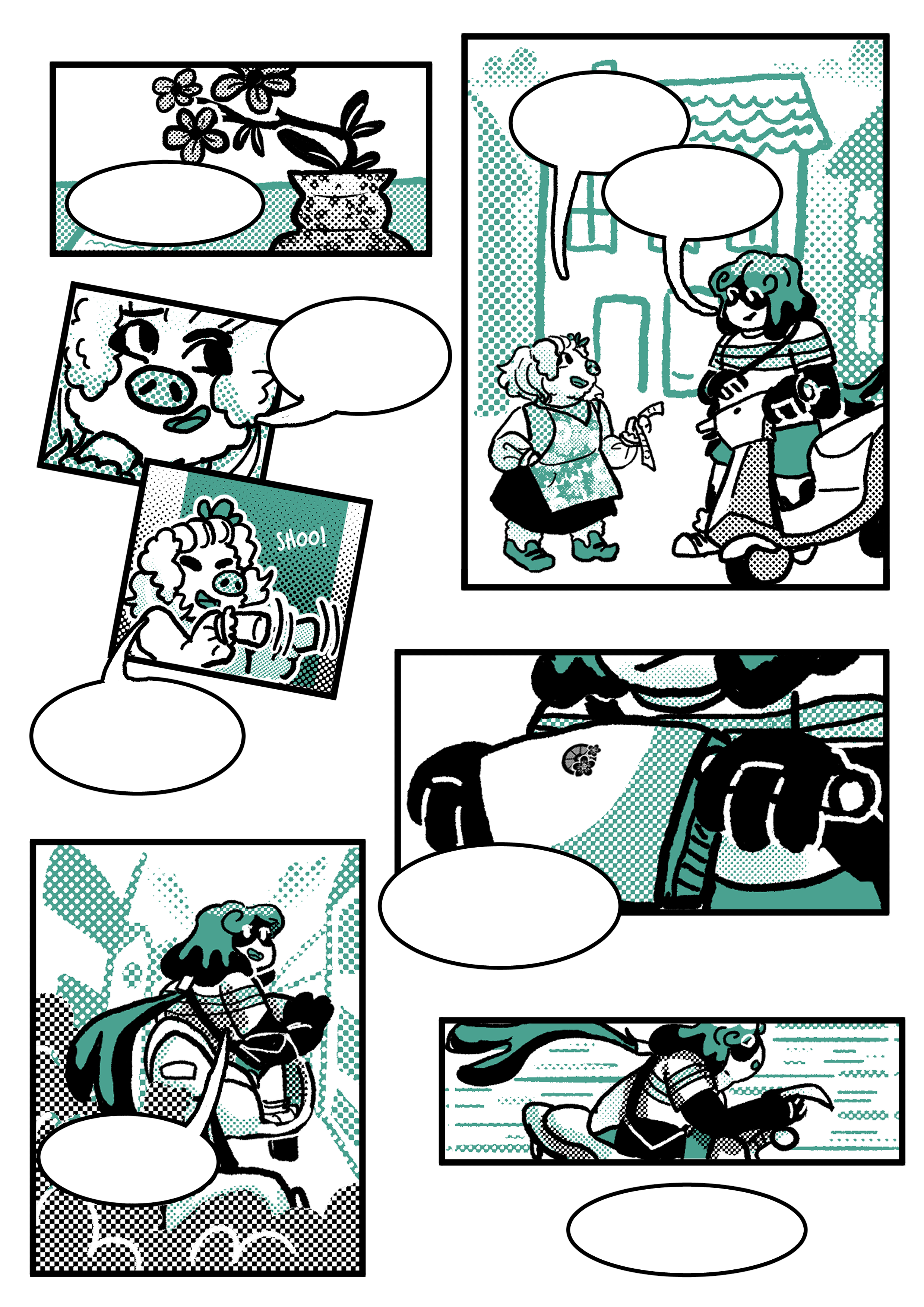
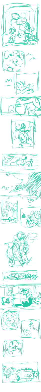
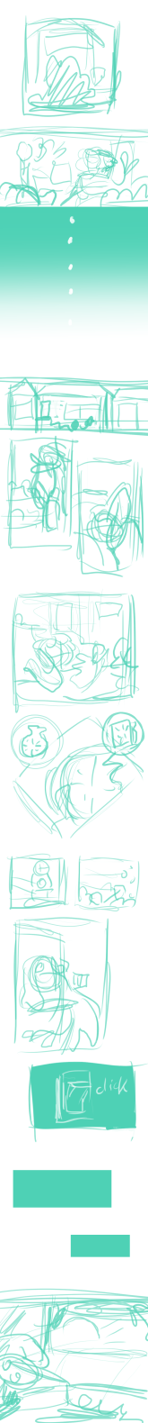
Once we had a brand and story theme in mind I started working on the story that would become The Bygone Market. I took the idea I had in one of the earlier iterations of an Orca historian who would know the history of the place they were in and repackaged it into Merryn, a graduated history student living in this worlds biggest dig site in their equivalent of the 1980s where the field is so saturated she's had to get a job as a florist to make ends meet. The concept seemed really cute and appealed to me a lot and most of the story was built up around the setting and this one character, although a larger cast would soon follow as I ideated on the kind of people who would live in that location. The flower shop owners are based on pigs I saw in an episode of Rick Stein's when he went to Cornwall and saw these super cute fluffy pigs called Mangalitsas, I loved the look of them and the name and the setting was already loosely cornish so Mrs and Mrs Mangalitsa, the flower shop owners, were born.
I wrote out what I wanted and a rough story outline to follow and armed with this knowledge got to trying to design some characters and settings.
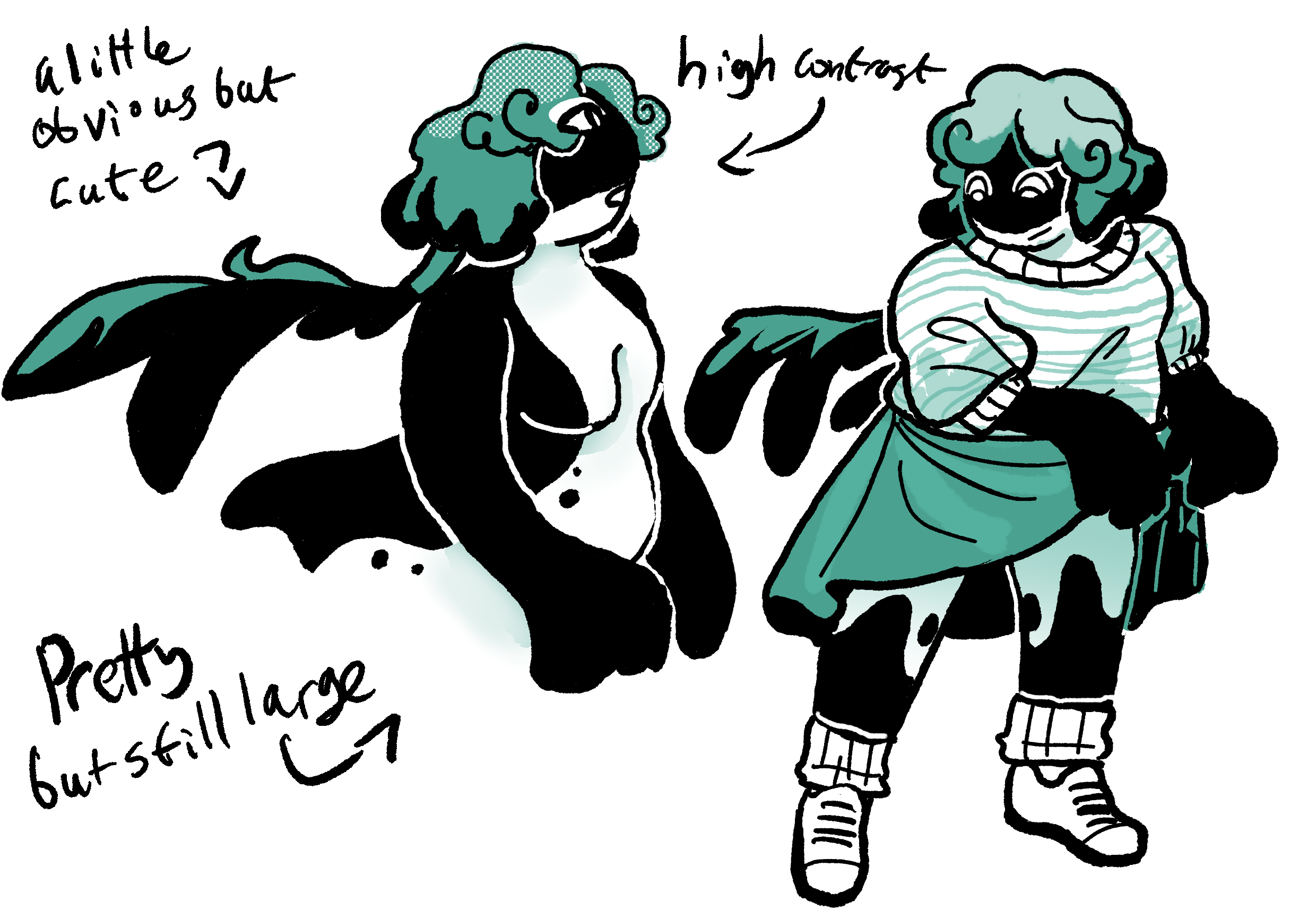
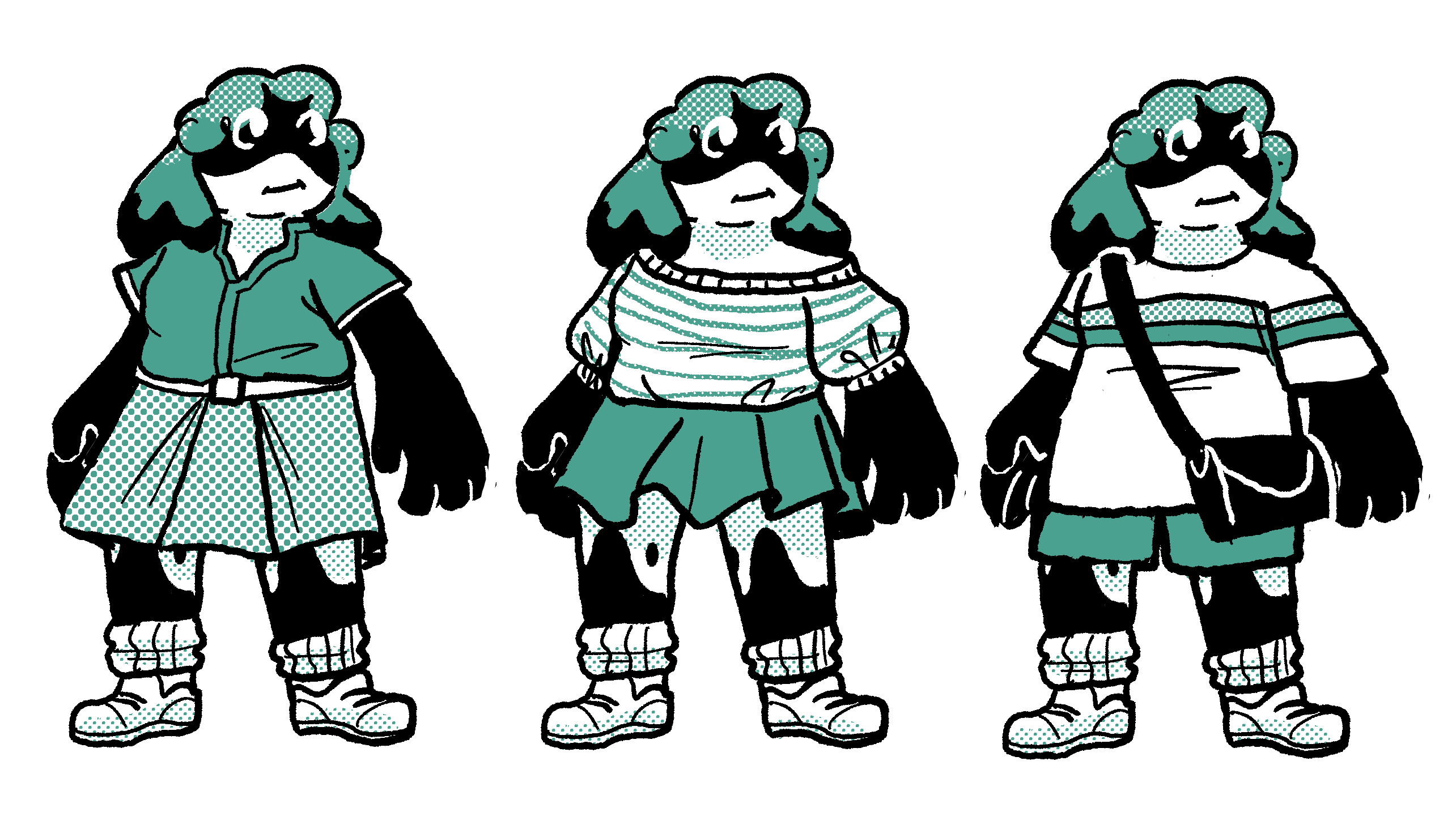
First art of Merryn was very heavily based on references of 1980s nerd fashion at the time as well as the idea of this very large but elegant character, she quickly devolves into a more cutesy simple character by the lineup, I drew some background art and ended up trying out this screentone style which I liked so mcuh it ended up as a defining style choice for Bygone, the idea was I didn't want to use any colours outside of the ones i was allowed but still wanted tones to draw with, this was a really geat compromise.
At the time I wanted Merryn to have
only one outfit throughout the
entire comic, this idea was scrapped
after our presentation
(more on that later)
and decided to use all these designs
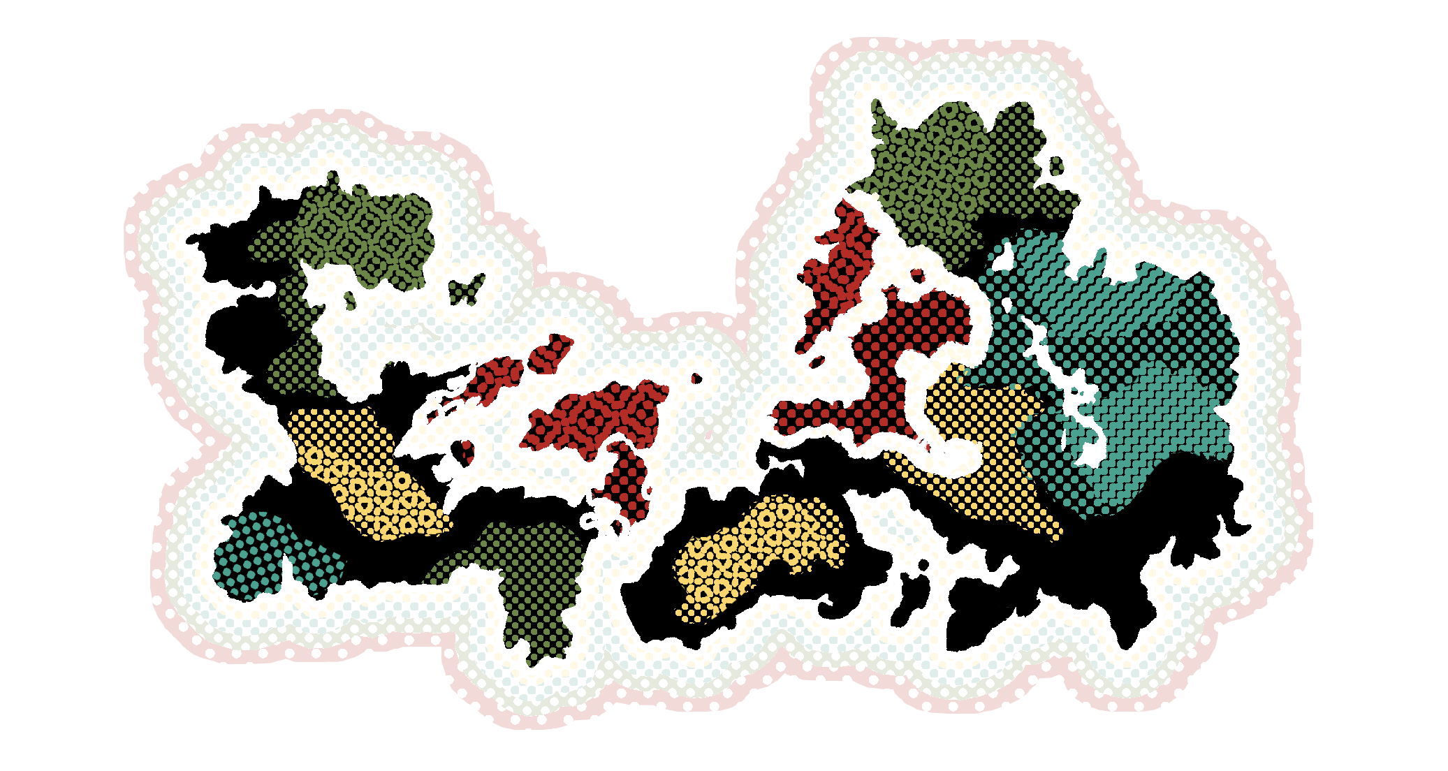
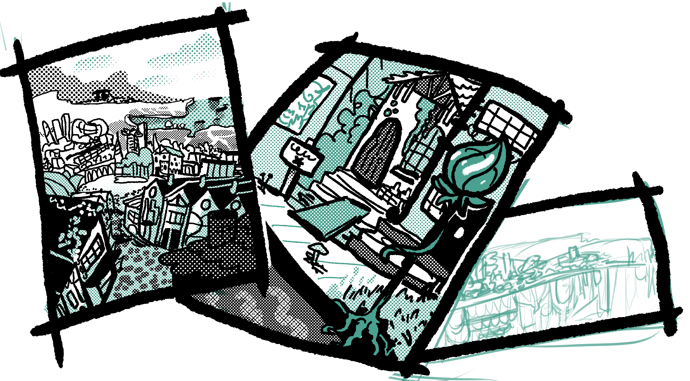
World map, drawn tohelp us
intro our ideas, I tried to think of it as a globe
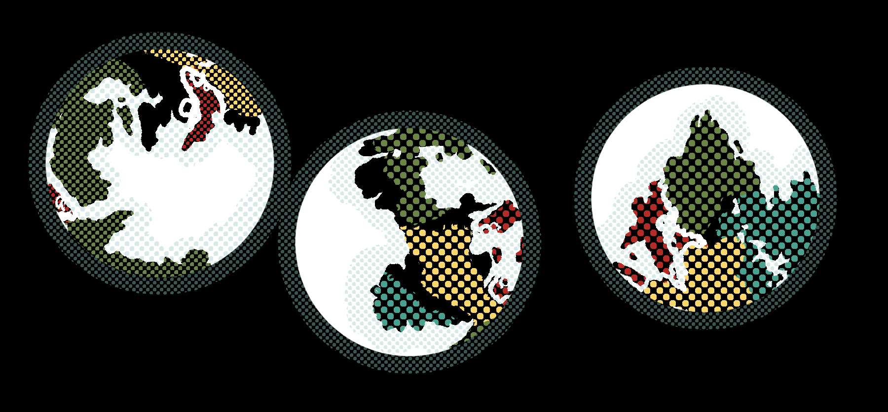
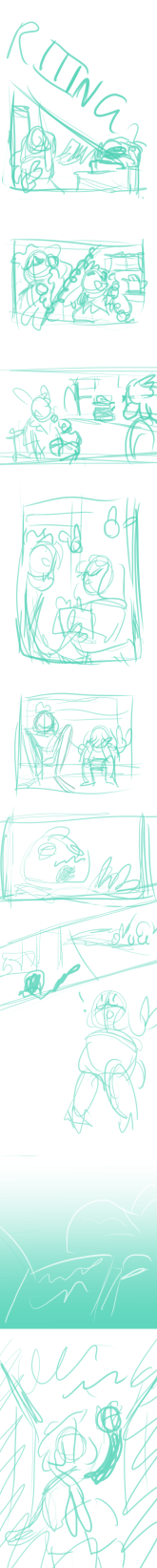
These extra character designs ended up happening pretty last minute before we presented our ideas and were done while I thought up ways to make the world of the story feel a little more lived in, some of these characters will show up later. The fish breaks style pretty badly and the seal looks uncanny but I'm very fond of this image
Step 3 - Professional presentation
All this previous work led up to what was one of the more nerve-wracking parts of the early steps of this process, presenting for three professional comic artists showing them our ideas. I made the mistake of looking them all up and being super impressed by their work so I was a little intimidated. I took all the work I had and made us a google slides to put the presentation into and inserted all my images, an intro and an ending slide. We discussed talking order as a group and due to my general confidence, I was tasked with going first and introing us in, although I think my nerves got the better of me since I had to ask for a little help when talking about the group concept to make sure I was covering everything.
Another interesting thing that happened was we presented in the afternoon, which means we saw a lot of wonderful presentations from our classmates. Because of this I noticed the wonderful branding of a lot of the other groups and decided to take the time we had left to quickly draw and insert a logo for the team. It was interesting to make and I kept in mind a lot of the tips given to us by Conan in a class he had given us before this.


Icon designs
Click this image to view the presentation!

After this presentation we each got feedback, all of which I found very encouraging and helpful and made me feel very set on the course I decided to take with The Bygone Market. This was also when I took the 'Ia' off Bygone since it was initially a wordplay on Begonia flowers which symbolise Caution for the future.
The feedback I received:
"This is really strong. The characters and the world in which they exist are well-thought-out. The visual reference is well chosen and helps bring a strong sense of location to the story. The character designs are great, as is the drawing generally. I feel that many more stories could be told using these characters" - Paul Mccaffrey
"Good background detail on the central character and some fantastic sketches for Orca and the varied supporting cast. I liked the setting and location art and the tasteful visual research on Pinterest. I'm looking forward to seeing some page thumbnails for this story." - Kevin Gunstone
"character design is charming, half-tones are sooooo good! just from an art point of view make sure you keep character faces clear and defined" - David Lyttleton
I tried to keep David's comment about facial clarity in mind throughout drawing the comic by making certain Merryn's facial features were never overlayed with the screentone part of her hair and kept the eyes all on the black part of the face where I can.
Step 4 - Script and Thumbnails
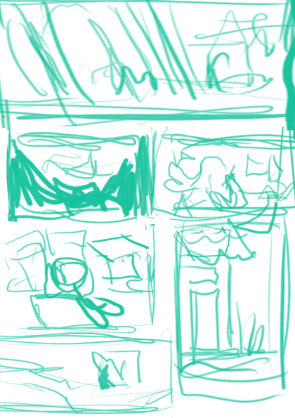
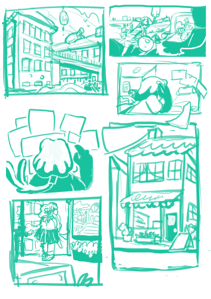
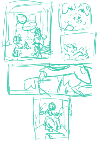
With all that out of the way I had two big tasks to accomplish, one is the marketing which I'll talk about next section, the other was getting a complete script and set of thumbnails for the next presentation goal. I'll admit at the start I took this pretty slowly since at the same time I was considering how I'd convert each page into an actual print comic page as well but as it got closer to deadline I had to complete all 20 thumbnails and that went to the wayside a little bit along with script clarity. This will come up later when I discuss the finishing process.
The time spent working on the finalised script was pretty high stress although I encountered a few helpful tips along the way such as writing in comic sans to help workflow and I often drew thumbnails at the same time as writing out the script in order to line the two up well and keep my brain focoused. I also took some of the early thumbnails and turned them into more polished sketches to test out both as traditional pages and a view of what I wanted finished pages to look like and the kind of workflow I wanted later on.
Page Thumbnails - Sketch - Finish
I shifted everything around quite a lot
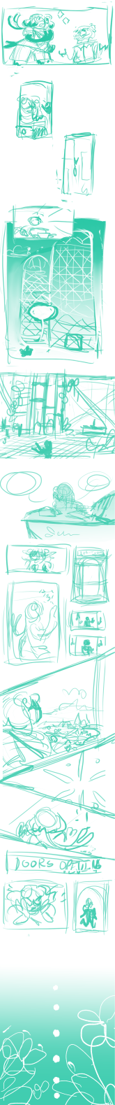

These thumbnails are all clicakble
I didn't add text or text boxes to them
but as I wrote the script out I
looked at the amount of text in each panel and planned spacing accordingly


second sketch layer
vs finished version
of pt 1
the sets were drawn with perspective rulers
and I added the screentone for the bgs
I decided to add colour to the covers. a
theme that continued throughout the comic


Panels were split
using the 'export webtoon' function on Clip Studio Paint, this let me easily export files that when put into tapastic or webtoon were acepted by the website, lined up perfectly and I was still able to keep large copies of all my panels to convert however I needed
Step 5 - Social Media advertising
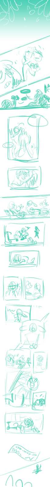
The first thing I did when setting up social media plans was to look up upcoming holidays, there were a few but I ended up making art for Valentines day as it's a popular one and we had just made visual novels last semester so I had dating sims on the brain. I also prepped concept art, character art, class doodles, and a process speedpaint to post. I wanted to bring a variety of things to do with my comic and with the team. It was also around this interval that i started to think about merchendising and streaming potential again and came up with a few designs I'd later test with audiences.
I found that twitter is a lot easier to post to from a computer setup and that I enjoyed the text and image based platform while I found Instagram fiddly, difficult to remember the existance of and kind of complicated having multiple places posts go and expectations of personal information I feel uncomfortable displaying in the 'stories' function. So, naturally, our instagram had significantly more followers and interaction.
I made sure to follow and interact with classmates work as much as possible and also follow other comic artists and collectives via our shared twitter to try and build a few connections to mixed success. Quite a lot of the interaction came from my own normal accounts and the followers I had there. It doesn't help that as deadlines got closer and the work got harder I struggled more to post anything that wasn't just comci update announcements, which aren't things that alone really excite people or encourage itneraction. If I could do it again I'd want a more forgiving schedule so I could prep more interesting social media presence, and have more help with posting since while my teammates made a few posts they also were clearly struggling as I sadly made up a large majority of the social media activity we had.
On a more positive note, I made and pinned a short animated trailor for the anthology which I feel got attention and was a very interesting way to draw people to look at our comics.
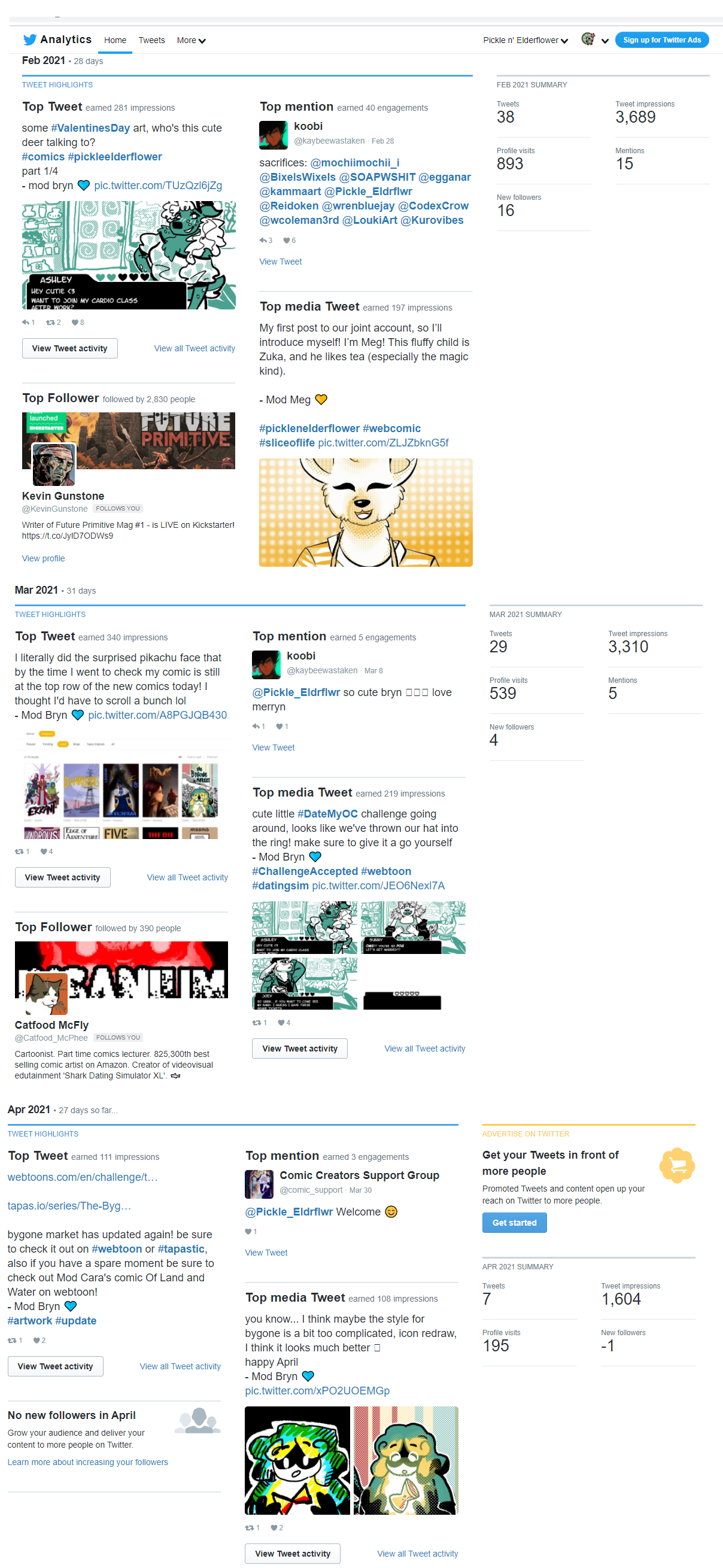

Our Twitter analytics showing how in the first month we made a lot of posts and got a lot of page views and interactions, the top posts being my valentines post and Meg's art of her comic's main character.
The next month was lightly fewer new followers and fewer posts but overall not bad. The top posts were again the valentines post and a text post I'd made with an image talking about the listing of The Bygone Market on webtoon.
In the last month's top posts were me doing an art meme for April fools and a post announcing a new chapter but only 7 posts were made and we actually lost a follower that month.

set up stuff to stream with on our twitch I made but I never ended up using the account sadly


valentines day post - This was recieved well, a good excuse to collab with one of the other teams (keyboard smash, who the lion character Sunny is from, though of course converted for Bygone's world) and I only had to draw one background to make it work which really saved time

Sketchbook and class doodles tended to do well on social media, they werre posted as well as concept art shown earlier and cropps of panels
The animation was a really cool thing to make and I also posted single slides from it to make the most of the content
Another interesting post was a speedpaint I captured on clip studio of myself rendering my second comic cover. I chose it because it was a colourful scene so I thought it'd be mroe interesting to see than a regular part of the comic

<--- click me!
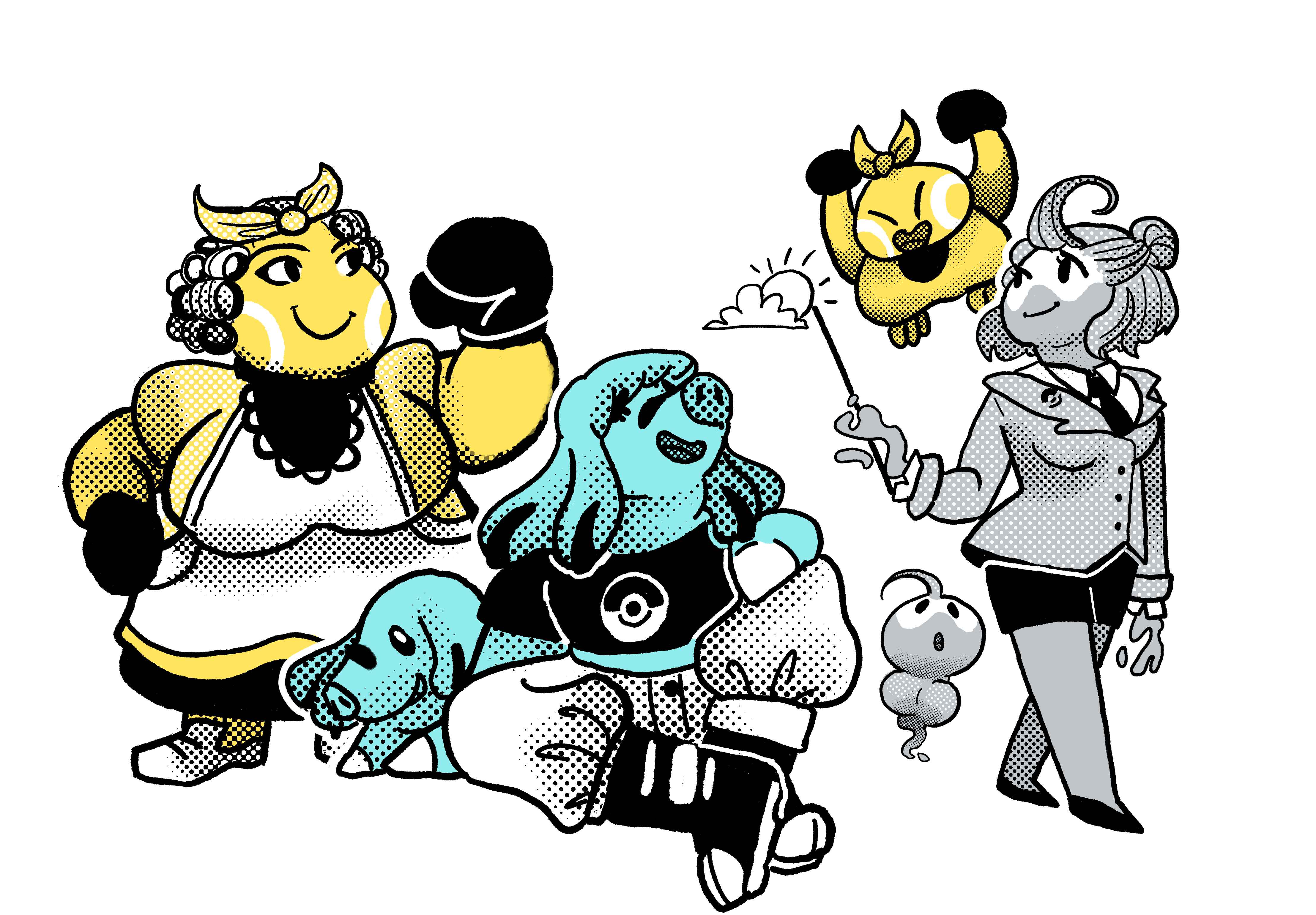
on pokemon day I drew some Gjinkas in the style of the comic since the characters in our world are based on animals and pokemon gjinkas are based on fictional animals
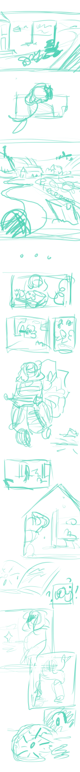
Step 6 - Making the comic
Making the actual comic is a process that started a week before my first post and finished on the 30th of April, the day of the final update. I set up a schedule to make a comic page for every tuesday and Friday for around 7 weeks in order to space out the workload. Most of the panels were inked in black with teal accents and coloured with varying screen tones. On occasion, I'd also bring in pops of the other comic's colours, most notably on the chapter covers and the final update. The process involved taking my thumbnails, interpreting them as sketches, which could be troublesome at times as some thumbnails were very quickly made and the script was unclear in places, and then inking and then adding the tones and colours, then adding the text and speech bubbles at the end.
All the comic pages can be found on webtoon and tapstic and I will link a clip from when I streamed the making of the final update as a way to see how I go about things. I'd say if I could do it again I'd want to have a clearer script but not necessarily all my thumbnails done at the time I was required to have them so I had space to have each thumbnail fresher in my mind as I rendered. I'd also love to have been able to make the comic over an even longer timescale of 13-14 weeks so I could update weekly, which is what I'd probably do for a similar project if I was wanting to do other work outside of it and keep up with my timetable every single time as a lot of updates were having text added still at the very end of the day of publishing and I missed two Tuesday updates and had to make up for them with double updates both days of the last week.
Step 7 - Webcomic stats
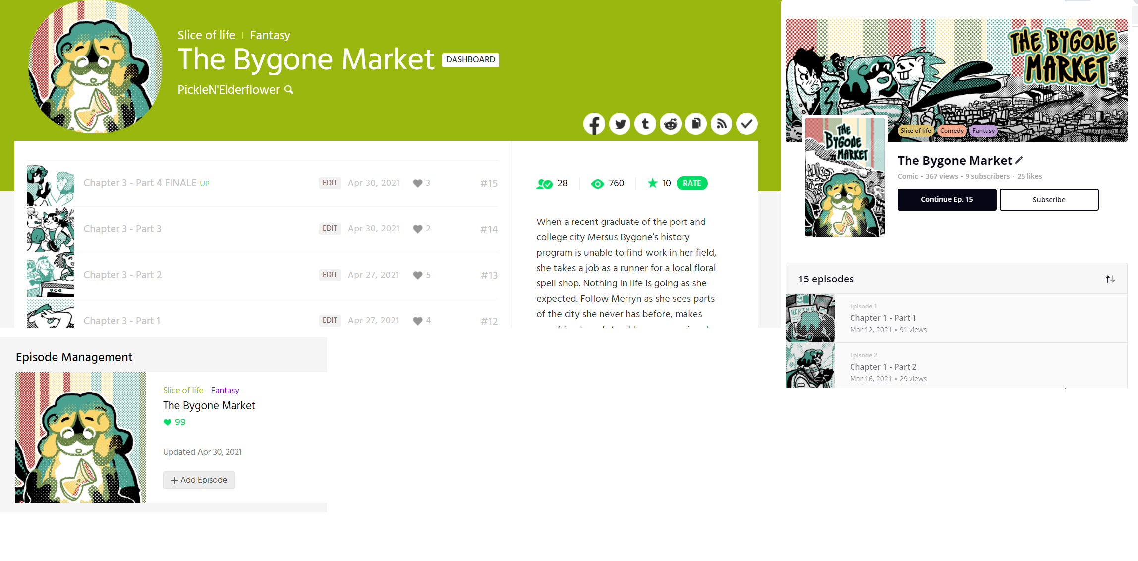
The Bygone market posted over the course of 7 weeks, from 12/03/21 to 30/04/21 with 15 updates, 14 of which were comic updates.
At present, the webtoon page has 758 views, 28 subscribers, 10-star rating, and 99 likes. The first update has the most likes with 15 which makes sense as any new viewers over the whole time will see that one first and people like less often the further into a comic they get, it also had 7 comments, I made a point to reply to every comment I got unless two were sent by the same person on the same post which helped interaction. I also got two instances of a comics collective choosing to promote my comic on their Twitter which often boosted my views. I got on average 100 views a week, so 50 views and update, this didn’t really shift all that much even on weeks I didn’t advertise too well, especially after I got over 20 subscribers. I think the key is making sure that updates are consistently timed and that you have long enough to build a good viewer count rather than posting in huge lumps, my last four updates which each had two in one day didn’t do as well as many of my others.
Tapastic, despite being advertised alongside webtoon every time, got significantly fewer views and less interaction with 367 views, 9 subscribers and 25 likes, and only 2 comments I can remember. I believe the site is less used and that the page where new updates from artists show up doesn’t let you linger as long as webtoon. I also think the tagging system in tapastic isn’t as efficient as the genre system on webtoon.
The final note is the updates where I asked for user interaction by asking about merch opinions, it did better than average on tapastic where it got a comment and did moderately on webtoon where it got 9 likes and 5 comments.
Overall I think I did moderately well on webtoon and that if I had advertised better I may have reached an even larger audience, but it seems once you have a certain number of viewers, they really do come back every week so long as you provide the comic, tapastic is much harder and less consistent but it is possible to get a little attention within 7 weeks.
Step 8 - Merchandising
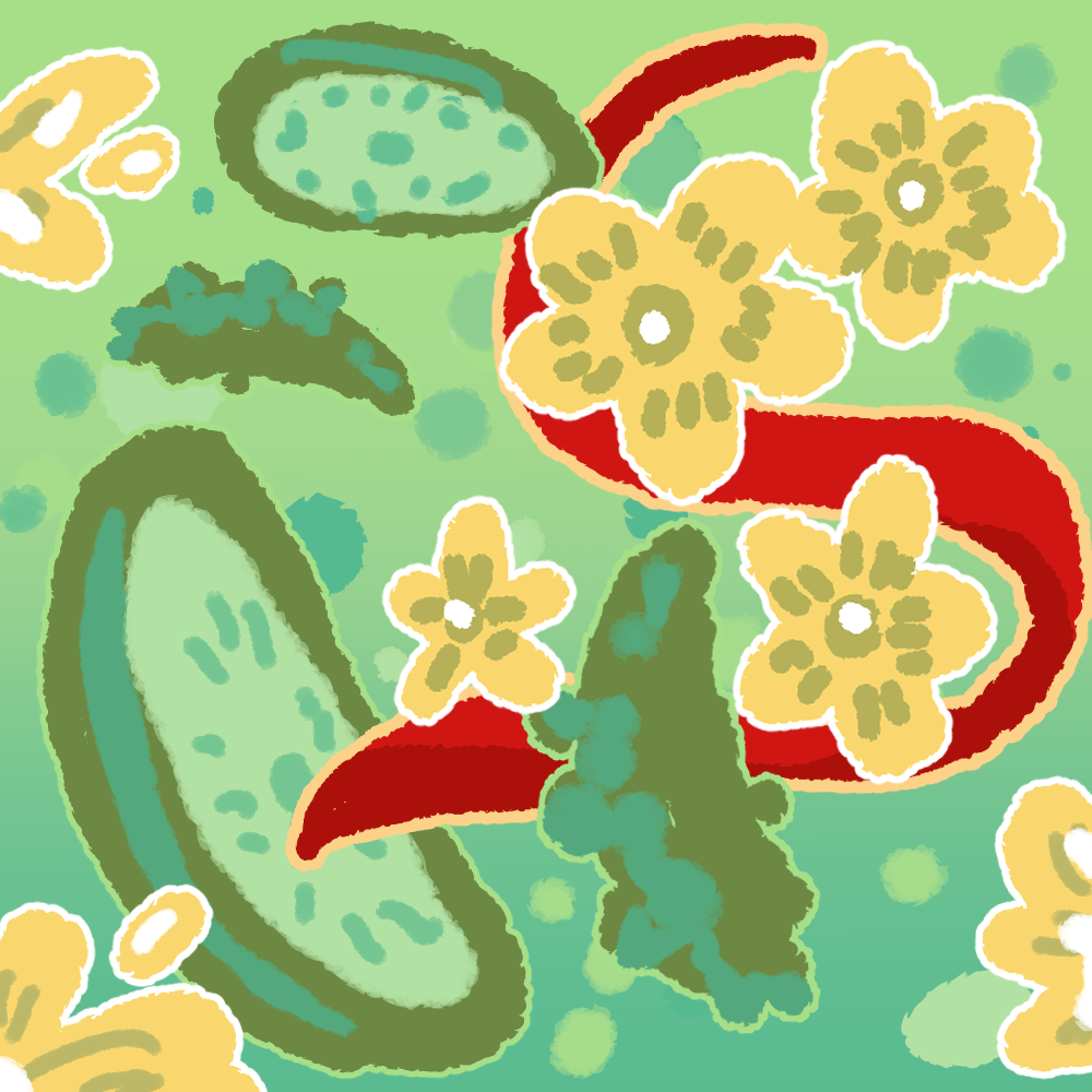
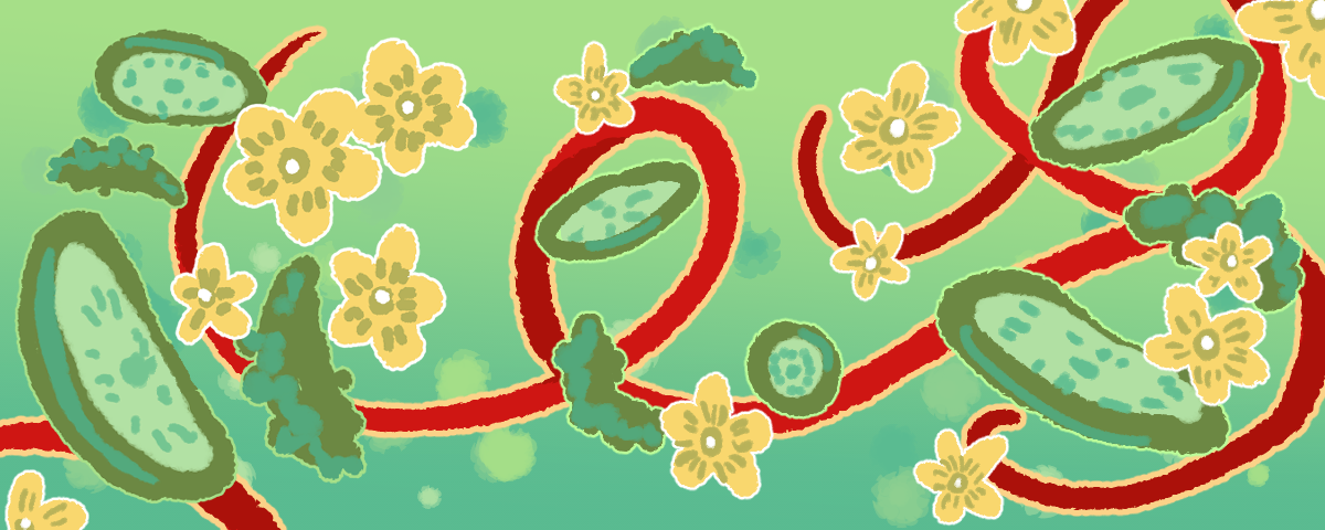
as a final thing, I tried my hand at merchandising, I thought it'd be interesting for us to have a shop and I submitted 7 of my own designs, two of which were repeating patterns. I thought it may be pointless to make everything available on all the range redbubble has but did it anyway to test my skills and to my surprise made a sale of a ring journal on the irst day it was up, at present we have made 3 sales, all of which are from my 'chemicals in the water turned this fish gay' shirt I designed. It's exciting that a comic with such a small following made even a couple of sales in this time period and I'm very proud of it. We chose redbubble due to it haveing no upfront cost and having the ability to make prints, stickers and shirts